MERGING THE AESTHETIC OF ALL 3 UNITS TOGETHER TO ENSURE A COHERENT AESTHETIC THROUGHOUT.
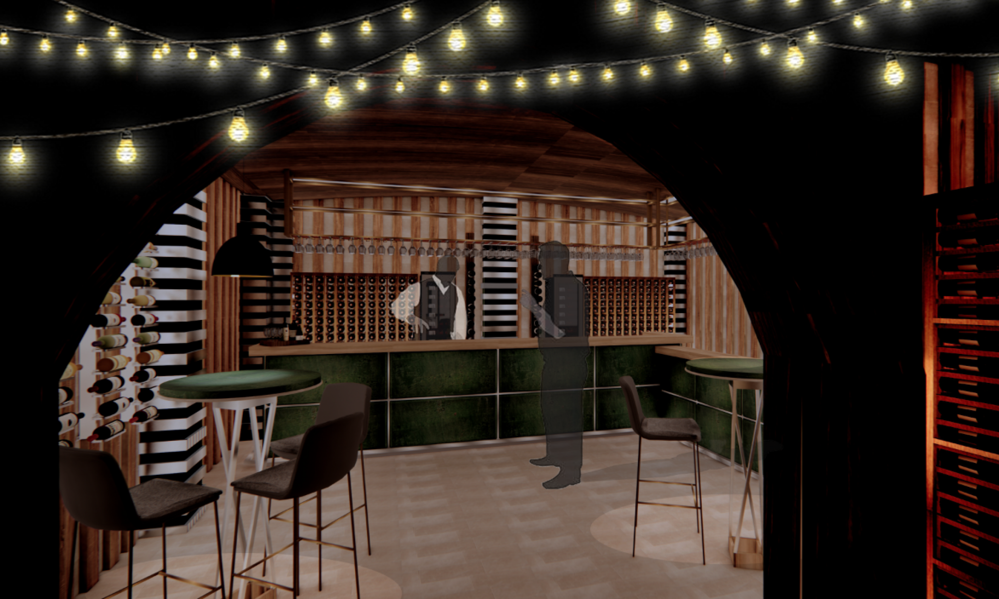
During the following weeks after the concept review, I focused on the wine ‘cave’, exploring textures, furniture and spatial circulation of the space. Initially, I experimented with the curves/arches which could be incorporated into the space. During this time I also experimented with furniture and the aesthetic of the space. I decided to incorporate the use of wine barrels as tables for the space, however after producing several conceptual visuals of what these might look like I found that they did not suit the space. Although I was still in the early stages of the design development, I was still unsure of how I wanted the space to look and after my barrel concept did not work out, I felt very lost. However, I then decided to explore all furniture options and experimented with different table heights. This allows the space to be filled with a variety of different lighting levels; ensuring the space is flooded with a variety of different shadows.
Changing the types of furniture used within the space and the different levels they were placed at made a huge difference to the aesthetic of the ‘cave’. This made me feel more confident to move forward with my design development. Once I had become more confident in my design progress with the bar space, I moved on to developing design ideas for the restaurant. As I mentioned In my previous blog post one of the main aesthetic features of the space was the wallpaper my granny chose for the original restaurant. I experimented with a variety of different materials such as wood and stone against the wallpaper and realised that due to its botanical features it perfectly blended in with the natural materials. My confidence has grown massively during this project and I believe that I have gained a better understanding of how to modernise vintage wallpaper to make them stand out in a contemporary setting. Whilst I wanted to make the wallpaper the main aesthetic of the space it was important to ensure that I did not overload the space and make it too busy. Therefore, to ensure this didn’t happen I complimented the wallpaper with natural features, this allowed the environment to stagger itself and become less overwhelming.
Alongside this, one of my main focuses was to ensure that I incorporated features from each unit into the others. The first thing I did during the design development process was to incorporate arch features from the wine cave space into CJ’s restaurant. As you can see from the images below the arched structures constructed out of wood in CJ’s restaurant links nicely with the wooden and stone arched formations featured in the wine bar. I have been incredibly inspired by the structural formations of caves throughout this whole project and this can be seen in the conceptual visuals I have produced during this section of the project.


